Central Crossing
A destination brand for the heritage heart of Hong Kong
This project was delivered as part of my work at Prophet. The project was co-developed by a multidisciplinary studio team. All 3D renderings are rendered by the Foster + Partners team. The content presented here reflects my personal contribution and learning within that collaborative context.
Project Type
Branding, Experience Design
Year
2021-2023
Origin
Hong Kong
Client / Collaborator
WingTai Asia
Role
Brand designer
Central Crossing is a 400,000 sq ft mixed-use destination on Wellington Street in Hong Kong's Central Business District, and the first Grade A development on a heritage site at the heart of the city. WingTai Asia's ambition went well beyond a landmark building. They wanted to create a world-class destination that could elevate the neighbourhood, give Hong Kongers a genuine sense of pride, and cement Hong Kong's position as China's most cosmopolitan city. As part of Prophet's brand strategy team, I shaped the brand story, the experience framework, and the strategic principles that would align every partner from architects Foster + Partners to Hyatt Hotels around a single, coherent vision.
BRAND STRATEGY
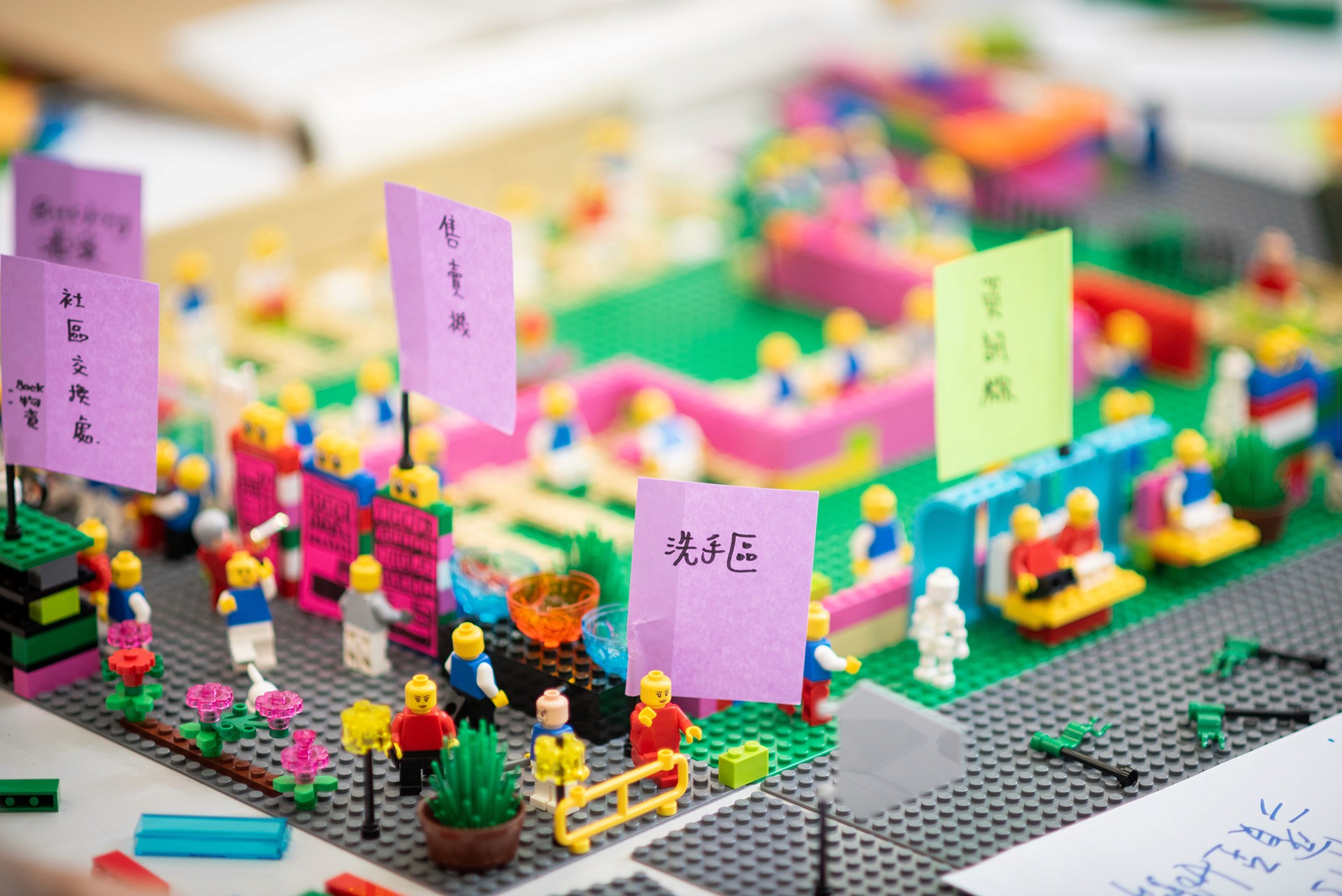
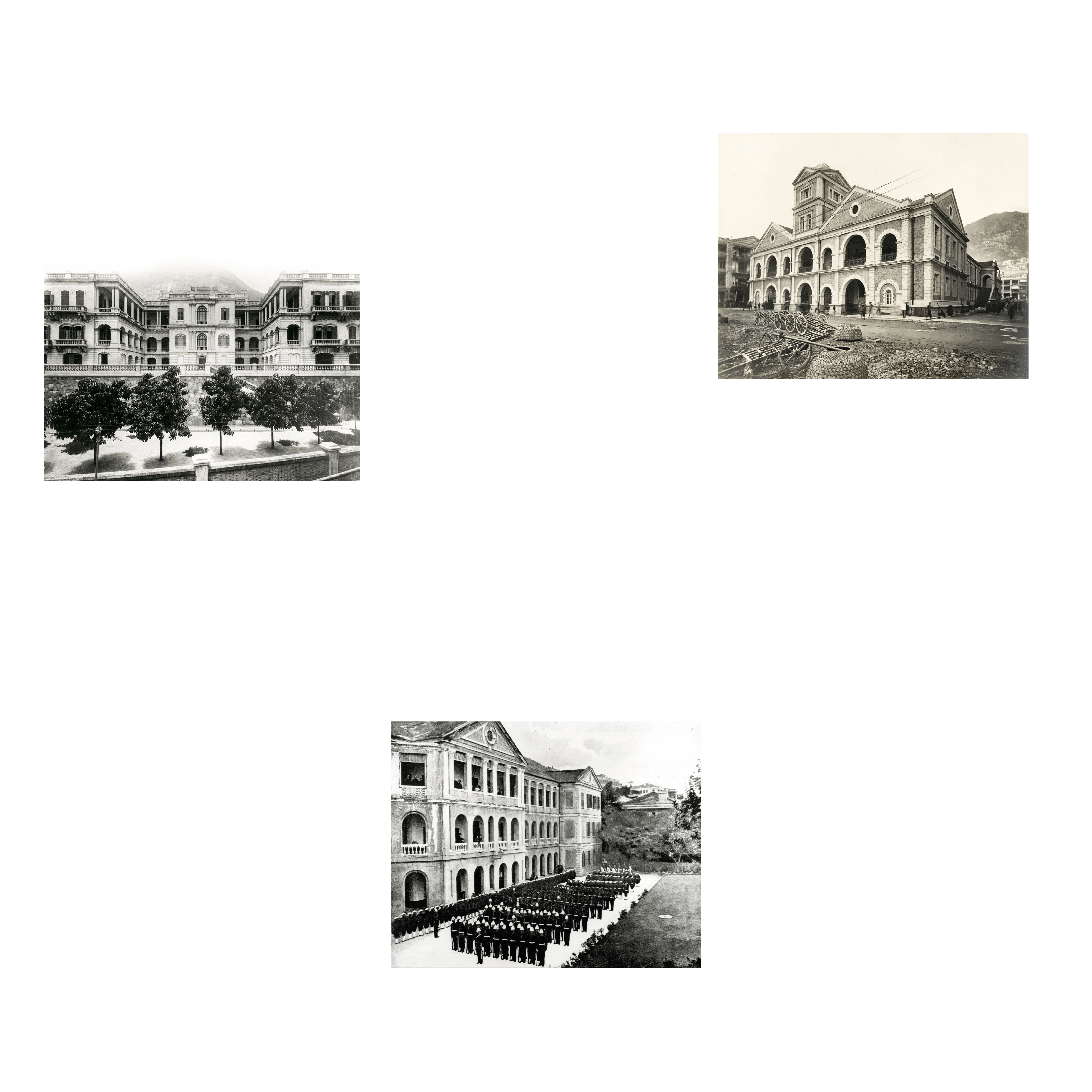
When we first mapped the neighbourhood, something became clear: Wellington Street sits at the precise centre of a heritage triangle formed by PMQ, Tai Kwun, and Central Market. Each of those sites had found a brilliant way to give a single heritage building new life. Our question was what the space between them needed to become.
Research pointed us toward an audience we came to call Life Connoisseurs — discerning, curious, and hungry for experiences that feel genuinely earned rather than packaged. What set them apart was a desire to inhabit heritage rather than observe it, to work inside it, eat beside it, stay the night within it. That distinction became the strategic unlock.
Wellington Street had always been a crossing. Leisure met commerce at its pavements. Heritage stood beside progress in its shophouses. Rather than smoothing that tension, we made it the brand's defining idea, a platform for crossing ideas, cultures, activities, and time. Everything that followed, from retail curation to the hotel's service philosophy, grew from the same purpose: to create a place for Life Connoisseurs to live to the fullest. The tagline Where People and Inspiration Meet carries that outward as an open invitation.

VISUAL IDENTITY
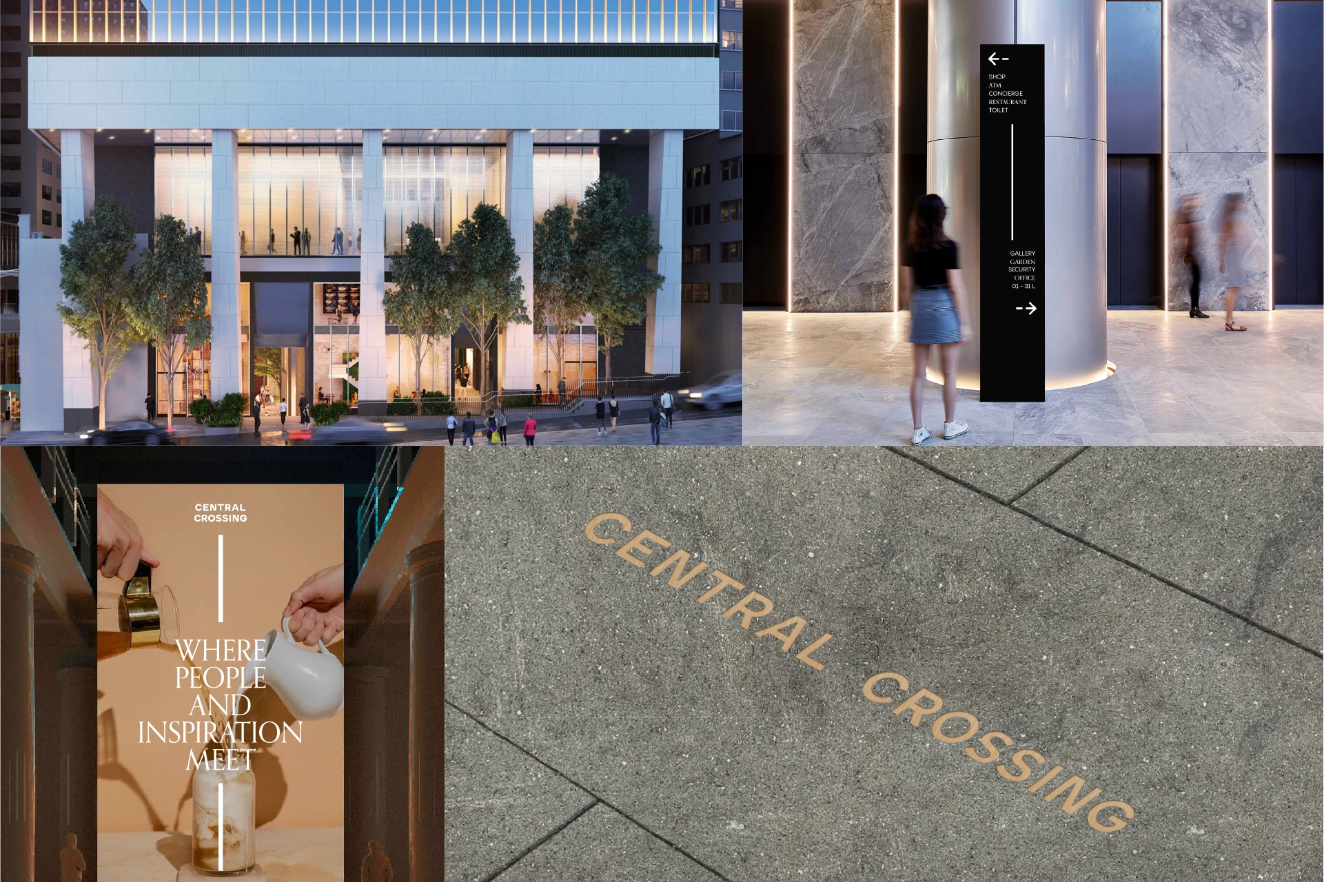
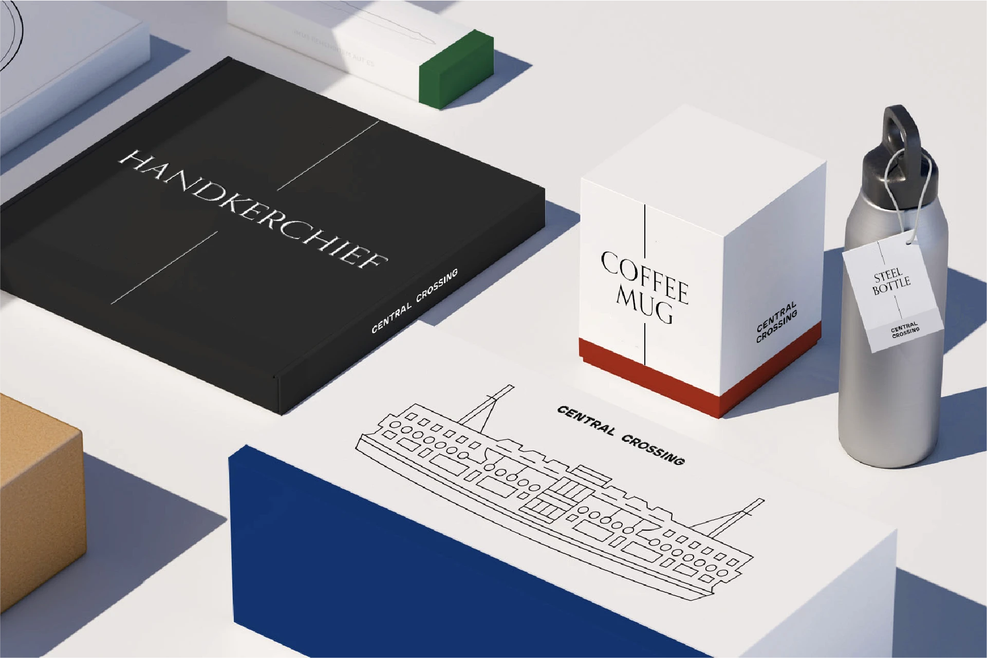
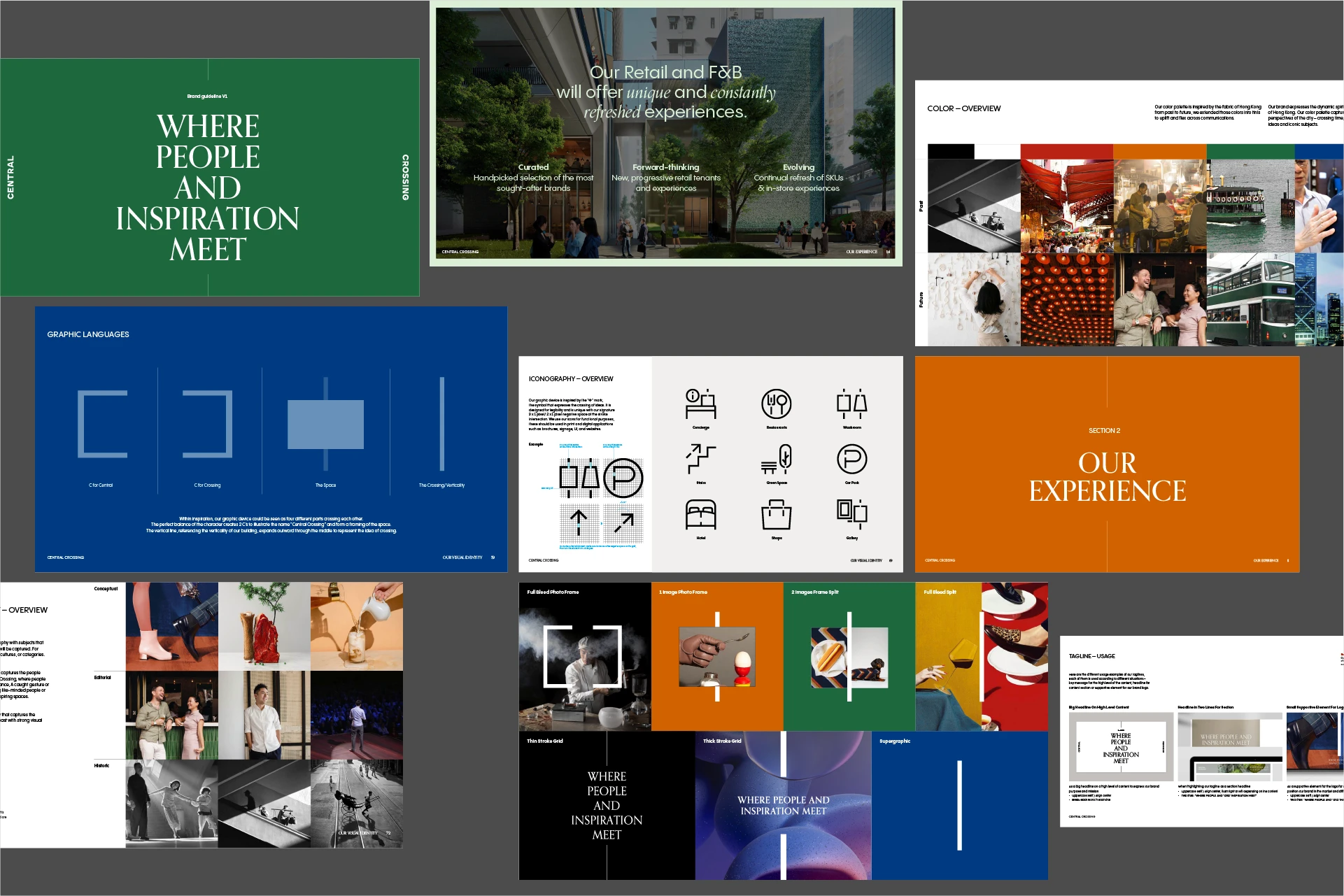
My team and I translated the crossing concept into a graphic device of surprising depth. The graphic language reads simultaneously as an aerial view of a crossroad, as a pair of mirror-image Cs where the road intersects the space, and as the Chinese character 中, the character for Central. A graphic system that speaks fluently in English and Chinese at every scale from a business card to a building hoarding.
We drew the colour palette from Hong Kong's material history. Warm grays anchored in the city's concrete and stone form the dominant palette, with precise pops of red, orange, green, and blue that capture the city's vitality across eras and moods. For typography, we wanted to bring an editorial confidence to the brand, placing Central Crossing in the same register as the world's best cultural and hospitality destinations. The system was built to keep pace with an always-evolving programme while remaining unmistakably itself.



THE EXPERIENCE
Where PMQ, Tai Kwun, and Central Market each do one thing brilliantly, Central Crossing was designed to hold all of them together and give the whole neighbourhood a centre.
The answer was a destination designed for full immersion rather than a visit. You could arrive for a morning meeting, stay for lunch in a restored shophouse, follow a digital heritage trail that reached back to Tai Kwun and PMQ, discover a new brand in the retail village, and end the evening on a hotel terrace. No other destination in the triangle could offer that arc in a single day.
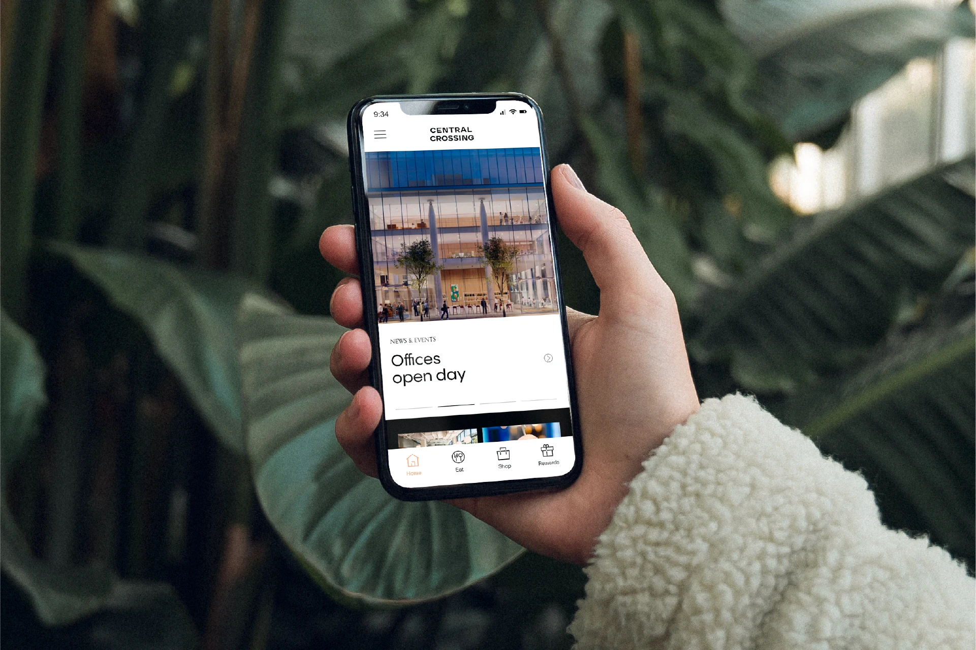
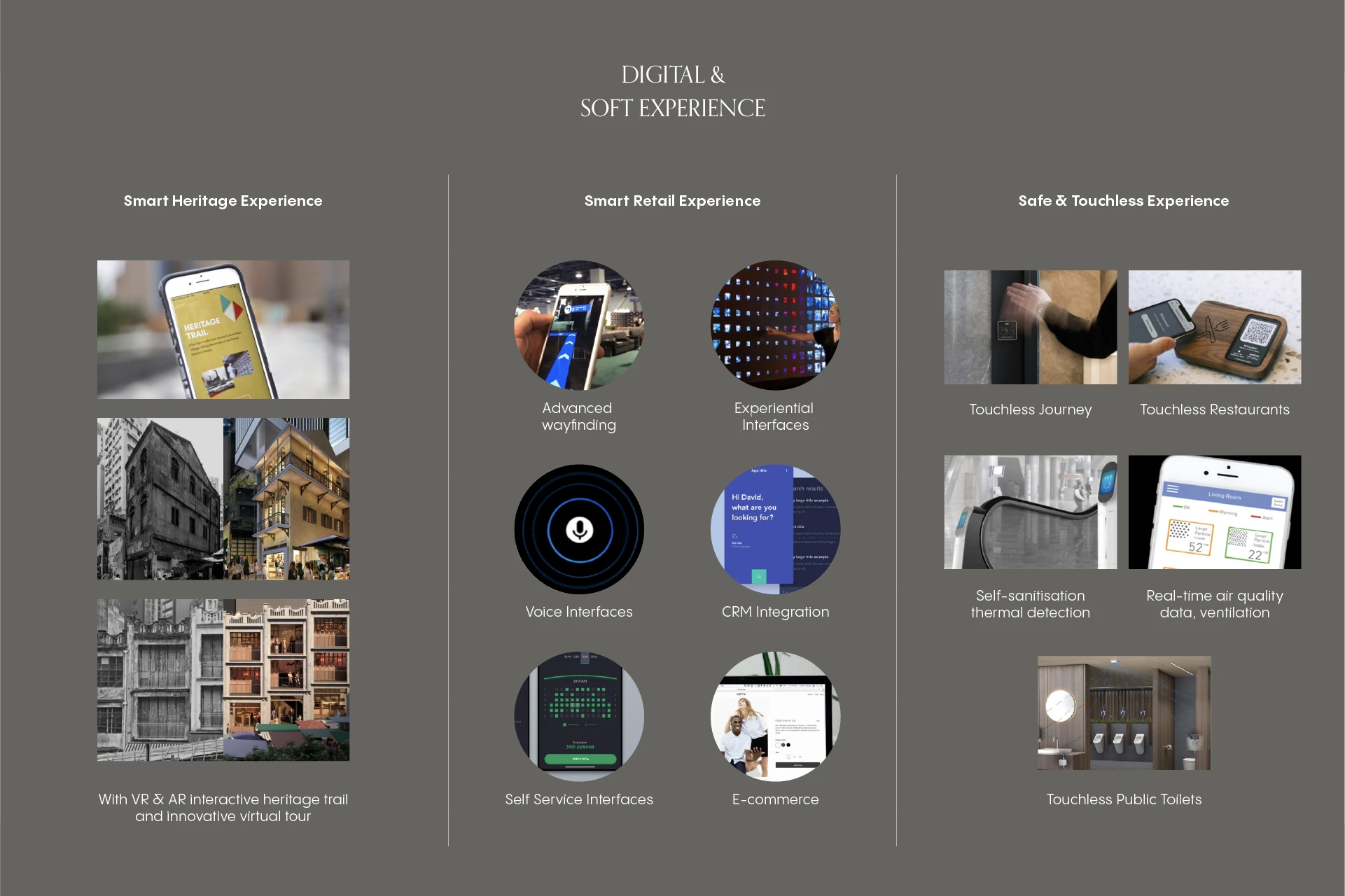
Layered beneath the physical experience was a smart neighbourhood ecosystem: a neighbourhood app, intelligent wayfinding, and social integrations that connected visitors across the entire triangle, not just the Central Crossing site. The digital layer was designed to make the neighbourhood feel navigable as a whole, drawing people deeper into the streets, stories, and offers around them.
The experience framework, four principles across five pillars from office to heritage to public open space, was built to make that arc feel coherent rather than accidental. Programming was designed jointly with Central Market, PMQ, and Tai Kwun, positioning Central Crossing not as a competitor but as the connective hub that makes the triangle feel like one neighbourhood.
RESULT
The Central Crossing name launched in July 2025 and the development opened in mid-2026, bringing together Grade A offices, the Andaz Central Crossing hotel, a lifestyle hub, a retail village, green open spaces, and preserved heritage buildings as one coherent destination at the centre of Hong Kong's Central. The branded website is a strong execution of the brand story, experience principles, and visual identity, and reflects the coherence between the original strategic framework and everything that was ultimately built.
Next Projects